Dream Design System
Developer on the core team
- Company
- United Wholesale Mortgage
- Industry
- Mortgage
- Timeline
- Jan. 2024 – Present
- Duration
- 2+ years, ongoing
TL;DR
- Developed 30+ of the system's 60+ React, TypeScript, MUI, and Storybook components from Figma specs.
- Partnered with the A11Y team to audit every component against WCAG 2.1 AA.
- Resolved 100+ support requests and presented the system to UWM's CTO, CMO, and VPs.
- Co-built the Dream MCP, an AI tooling layer that makes the system queryable by AI agents, now in beta at UWM.
- React
- TypeScript
- MUI
- Storybook
- Figma
- Design Tokens
- WCAG 2.1 AA
UWM had no unified design system. Designers and developers were working from inconsistent patterns, duplicating work, and shipping products that felt different across every team. I joined a small designer-developer team to build Dream, UWM's first design system, and I've spent the last two years working at the seam between design and engineering: implementing components from Figma, pushing back on design decisions that didn't hold up, and helping the system land with the teams that had to use it.
My Role
One of a small designer-developer team building Dream from the ground up. I developed 30+ of the system's 60+ components from Figma specifications. The handoff wasn't one-way: designers and I worked closely on each component, and when a spec didn't hold up under real-world cases (states, edge cases, accessibility), I flagged it and we worked through the fix together. Several components shipped with design changes that started as my pushback.
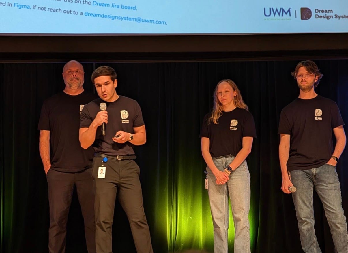
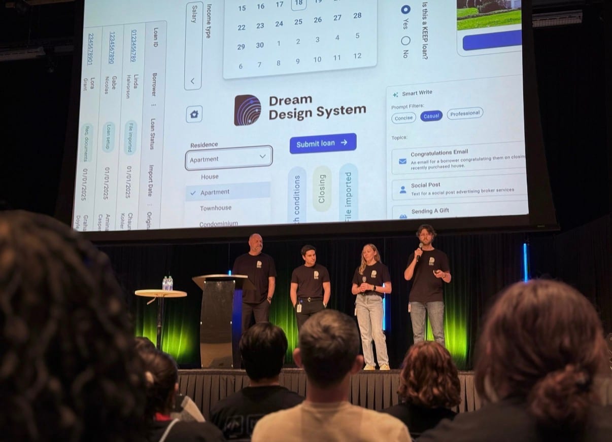
I contributed to the Figma guidelines file alongside the designers, fielded 100+ support requests from product teams adopting Dream, and partnered with the A11Y team to audit every component against WCAG 2.1 AA. I also helped lead a multi-week support campaign for Dream, presenting to UWM's CTO, CMO, and VPs to build alignment across the organization. I later presented the system and the benefits of using it to the broader organization at a UWM All-IT meeting.
Problem
Without a shared foundation, UWM's digital products lacked consistency. Designers and developers worked from different sources of truth, teams solved the same problems independently, and accessibility had no formal standard. The result was duplicated effort, slower delivery, and a fragmented experience for the users navigating across those products. Dream was built to solve all of it.
Different teams. Different components. 0 consistency.
Process
Agile, iterative, and never truly finished. Phases loop back and inform each other continuously.
- 01
Research & Discovery
Before a single component was built, we audited existing UWM products, identified UI inconsistencies, and defined what Dream needed to solve. This human-centered discovery phase ensured the system was grounded in real problems rather than assumptions.
- Human-Centered Design
- UI Audit
- Problem Framing
- 02
Stakeholder Alignment
With a proof of concept in hand, we presented the vision for Dream to the CTO, CMO, and VPs. These conversations were about building organizational understanding of why a design system mattered, not just securing approval.
- Stakeholder Presentations
- Executive Communication
- Advocacy
- 03
Building & Iterating
Components were built with React, TypeScript, MUI, and Storybook, each developed from Figma specifications in close collaboration with designers. Working within an Agile framework, the process was cyclical: build, review, refine, repeat.
- React
- TypeScript
- MUI
- Storybook
- Figma
- Agile
- 04
Documentation & Support
Storybook served as developer-facing documentation with interactive previews and code examples. A Figma guidelines file served designers with specs and usage rules. I handled 100+ support requests, ensuring every team could adopt Dream successfully.
- 100+ Support Requests
- Documentation
- 05
Accessibility Reviews
We partnered with the A11Y team to audit every component in Dream against accessibility standards, applying inclusive design principles across the entire library. This was an ongoing collaboration, not a one-time check.
- Accessibility
- Inclusive Design
- WCAG
- 06
Continuous Feedback
The work does not stop at shipping. We actively listened to the teams and consumers relying on Dream every day through a dedicated Airtable feedback form where teams could submit suggestions and new component ideas directly. A consumer satisfaction survey was also released to gather broader structured feedback and surface opportunities for improvement. Because a design system is never truly done, it evolves with the people it serves.
- Consumer Research
- Continuous Improvement
Solution
Component Library
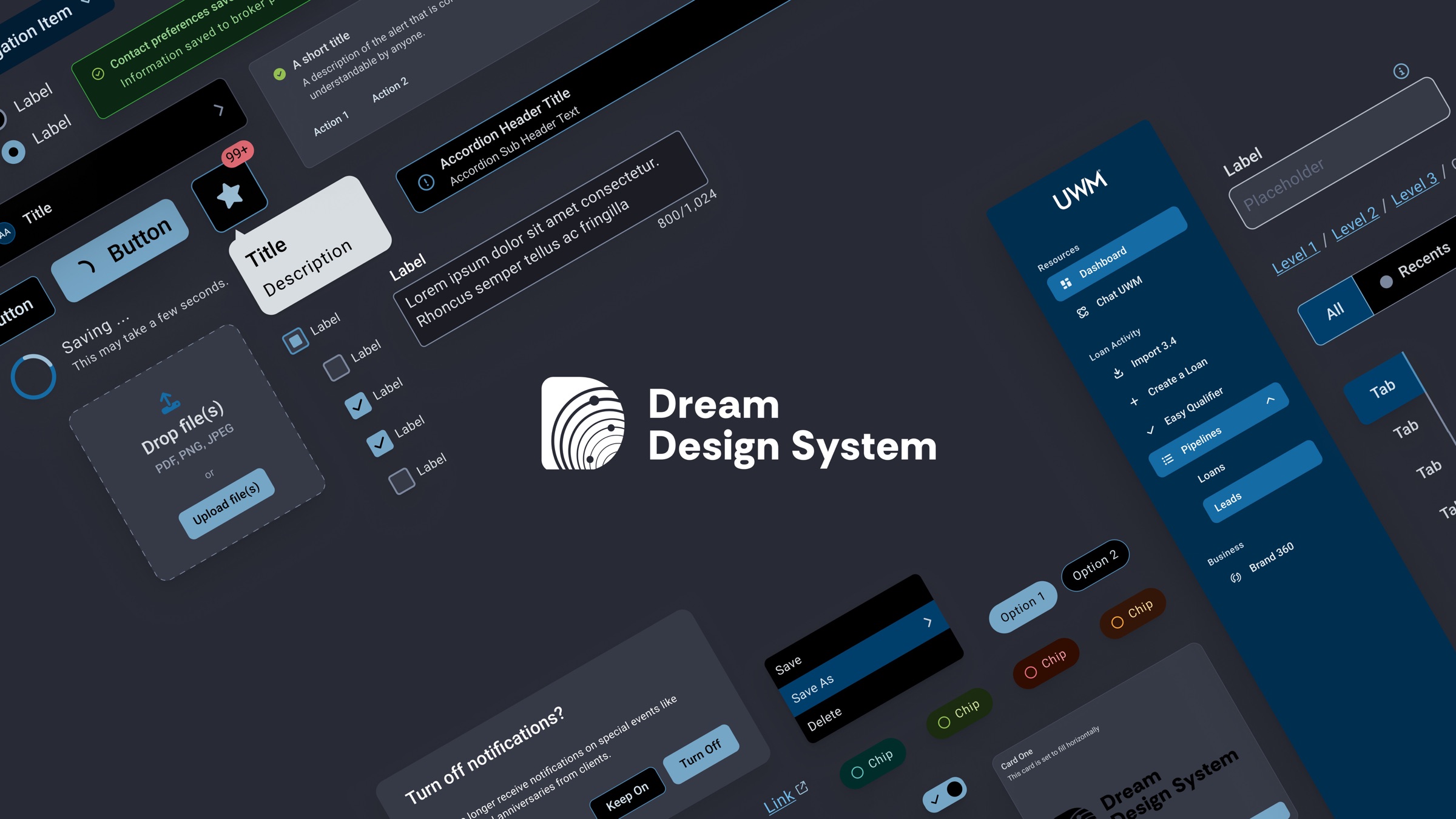
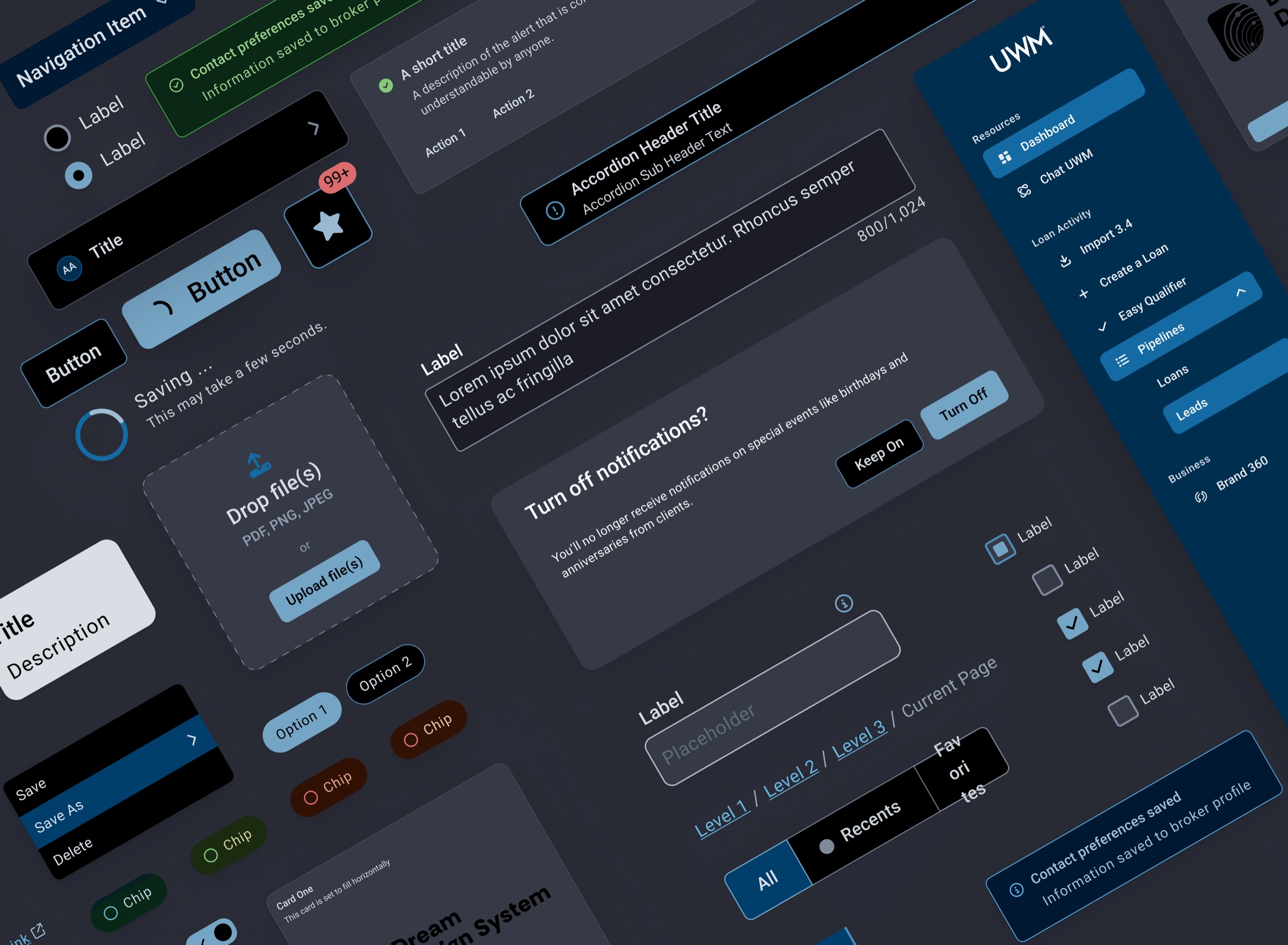
At the core of Dream is a library of 60+ reusable UI components built from Figma specifications, with the implementation done in React, TypeScript, MUI, and Storybook. Each component went through a design-and-development loop: a spec from the design team, an implementation pass, a review against real-world states and edge cases, and a final shared decision on what landed. I developed 30+ of the 60+ components and was part of those decisions on each one.
Design Tokens & Theming
Dream was built around a token architecture covering color, typography, and spacing. The system supported multiple themes, with distinct token sets for different product suites, each offering light and dark modes, creating a shared design language that scaled across a diverse product ecosystem.
One of those design directions came from me: I argued for splitting themes by internal-facing versus external-facing product lines. UWM employees move between admin tools and customer-facing products all day, and a distinct visual language between the two would tell them at a glance which environment they were in. The design leads ran with the idea, and the multi-suite theming structure became one of the foundations of how Dream scales.
Primitives hold raw values. Semantics reference primitives and switch per theme.
Component
Card Title
A simple card component consuming semantic tokens.
Semantic tokens
color.button.primaryblue-500color.surface.defaultwhitecolor.text.defaultgray-900color.text.subtlegray-500
Primitives
- blue-500
- blue-300
- green-500
- green-300
- gray-900
- gray-500
- gray-100
- white
Documentation
Storybook gave developers interactive component previews and code examples in a tool that fit naturally into their workflow. A Figma guidelines file, which I contributed to alongside the designers, gave designers component specs, usage rules, and design rationale in theirs. Both audiences had the documentation they needed without having to work in an unfamiliar tool.
Button
A versatile button component supporting multiple variants, sizes, and states. Built to WCAG 2.1 AA accessibility standards and available across all product suites.
Usage
import { Button } from 'dream-ui'

<Button variant="Primary" size="md" />
Preview
Props
| Prop | Type | Default | Description |
|---|---|---|---|
| variant | string | "Primary" | Visual style variant |
| size | sm | md | lg | "md" | Component size |
| disabled | boolean | false | Disables interaction |
| onClick | func | undefined | Click handler callback |
Support Infrastructure
A dedicated Microsoft Teams channel (#dream-support) gave consumers a direct line for urgent requests, bug reports, and real-time help. An Airtable feedback form allowed teams to submit suggestions and new component ideas on their own time, feeding directly into the backlog. Together these two channels ensured no one was left without a path to get help or contribute to the system.
Microsoft Teams
#dream-support
A dedicated channel for urgent requests, bug reports, and real-time help. Teams could reach the design system directly and get a fast response.
100+ requests resolved
Airtable
Component Request Form
A structured form where teams could submit new component ideas, improvements, and suggestions on their own time. Responses fed directly into the backlog.
Contribution Model
Clear contribution guidelines gave teams across UWM a path to propose, build, and submit new components to Dream, allowing the broader organization to participate in the system rather than work around it.
- 01
Propose
Submit a new component idea via the Airtable request form with a use case and priority.
- 02
Build
Approved proposals are developed against Figma specs with React, TypeScript, MUI, and Storybook.
- 03
Review
Components are reviewed for design accuracy, accessibility standards, and code quality.
- 04
Merge
Approved components are merged into Dream, versioned via SemVer, and released with change logs.
AI-Friendly Tooling: The Dream MCP
The newest layer of Dream is one I co-built: the Dream MCP, an AI-friendly tooling layer that makes the design system queryable by AI agents. It is currently in beta inside UWM, and the work behind it earned one of my two UX Innovation Awards.
Outcome
From zero to a shared foundation trusted by the entire organization.
- Components
- 60+
- built and shipped to production
- Projects
- 50+
- adopted Dream as their foundation
- Requests
- 100+
- resolved across support channels
- Major Releases
- 3
- versioned and shipped with change logs
“This is the most inspiring project I've seen on this stage.”