Design Standards Website
UX intern, research & desktop design lead
- Company
- United Wholesale Mortgage
- Industry
- Mortgage
- Timeline
- May 2022 – Aug. 2022
- Duration
- 4 months

TL;DR
- Designed a website introducing employees, designers, and developers to UWM's design standards.
- Led stakeholder interviews, lo-fi wireframes, usability testing with 8 participants, and the hi-fi prototype.
- Presented to UWM's entire IT floor at the end of the 12-week internship.
- Two years later, the groundwork became the Dream Design System, adopted by 50+ projects.
- User Research
- Wireframing
- Usability Testing
- Affinity Diagramming
- Prototyping
- Figma
Before UWM's Dream Design System existed, UWM needed a way to show the organization what a design system could be. As a UX intern, I was tasked with designing a website that would introduce employees, designers, and developers to UWM's design standards and demonstrate how they could be used to create consistent, cohesive products. Working alongside UX designers, engineers, architects, and senior leaders, I led the research, wireframing, user testing, and high-fidelity prototype for the desktop experience. 12 weeks of work culminated in a presentation to the entire IT floor that helped lay the groundwork for what would eventually become the Dream Design System.
My Role
I led the research and design of the desktop version of the design system website. This included conducting discussions with developers, designers, and marketing professionals across UWM to identify pain points, creating lo-fidelity wireframes, running usability tests with 8 participants, synthesizing findings into an affinity diagram, and designing the final high-fidelity prototype. I also presented the work to the IT department at the end of the 12 week internship.
Problem
UWM had no unified design standard. Designers worked from different sources of truth, applications looked like they came from completely different companies, and there were no centralized guidelines for color, typography, or components. Before a design system could be built, the organization needed to understand why one was necessary and what it would look like. The website was the answer to that question.
Every department had their own color & typography guidelines. None of them matched.
Marketing
Engineering
Product
Design
“We have a few different color palette documents but nothing centralized. Everyone is working from something slightly different.”
Research
Three methods to understand, test, and map the path forward. Understanding the organization, testing the design, and mapping adoption.
- 01
Stakeholder Interviews
Before any wireframe was drawn, we talked to developers, designers, and marketing professionals across UWM. We asked questions like: Where do you currently go when you need design guidance? How do you ensure consistency across your work today? What would make a centralized design platform useful to you? The answer was consistent across the board. Users had little to reference beyond a few scattered color palette documents spread across different departments. There was no single source of truth, and everyone knew it.
- Qualitative Research
- 02
User Testing
With a lo-fidelity wireframe in hand, I conducted usability tests with 8 participants across UWM. Each session walked participants through three tasks: navigating to the color section, identifying the typeface in use and why, and locating specific type scale specifications.
- Lo-Fidelity Wireframe
- Usability Testing
- 8 Participants
- 03
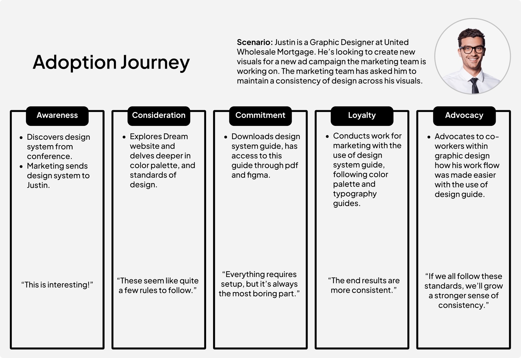
Adoption Journey
Drawing from interviews and testing, we mapped the ideal journey of a first time user of the design system website. From initial awareness through to advocacy, this provisional map helped the team understand how employees would discover, commit to, and ultimately champion the design standards across the organization. The persona and quotes are illustrative, written to capture the attitudes we heard in stakeholder conversations rather than quoting any one participant verbatim.
- Mapping
- Synthesis
- Empathy
Solution
The solution was a documentation website that gave every designer, developer, and stakeholder at UWM a single place to understand the design standards. The site covered color, typography, and components, each with clear guidelines, usage examples, and specifications. Navigation was organized around how people actually worked, not how the system was structured. A site map defined the content hierarchy, wireframes were tested with real users before moving to high fidelity, and the final prototype addressed friction points surfaced during testing.
From site map to high-fidelity prototype
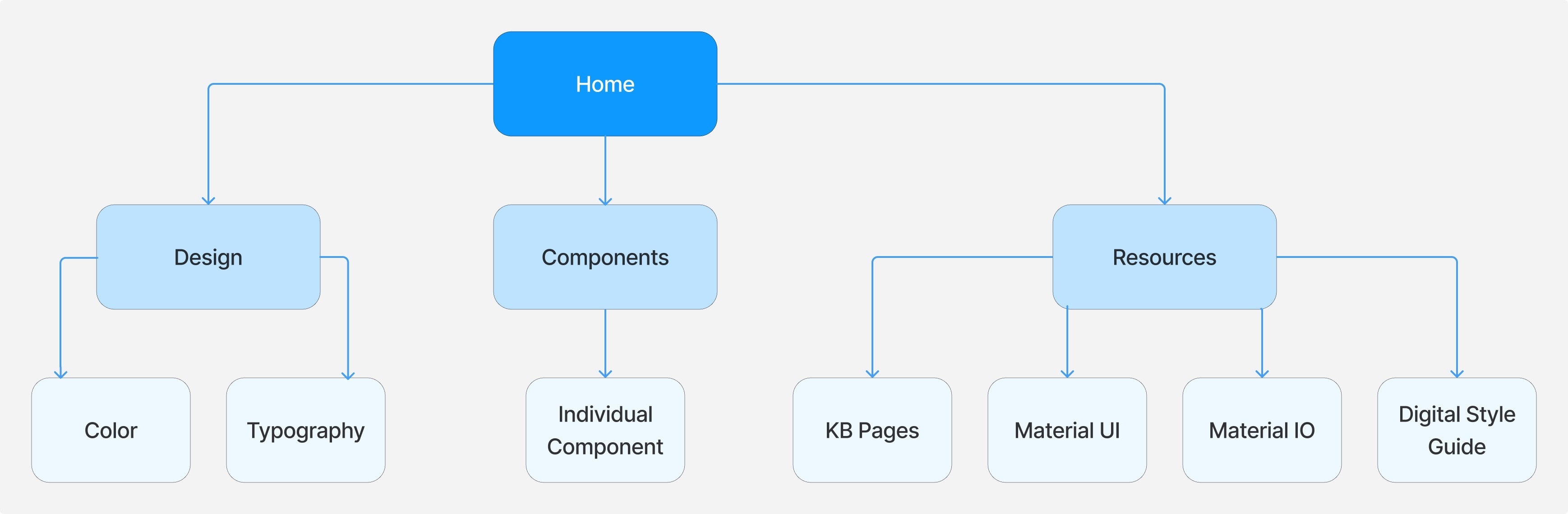
Before any screen was designed, the content hierarchy was mapped out to ensure intuitive navigation. The site organized into four key sections: Home, Design, Components, and Resources, each with clear sub-pages beneath.
- 01
Site Map
Content hierarchy mapped across Home, Design, Components, and Resources for intuitive navigation.
- 02
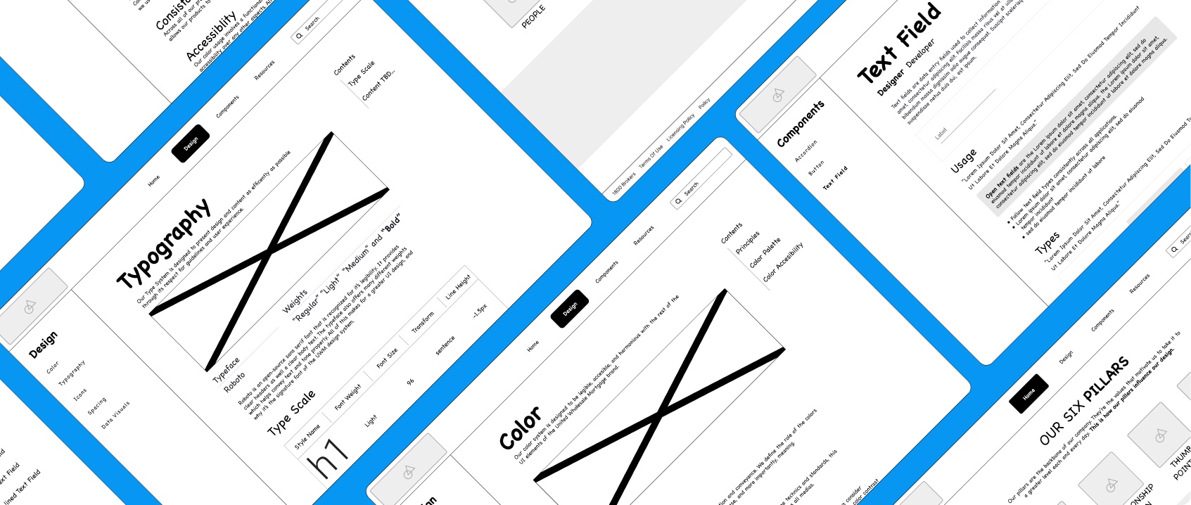
Wireframes
Lo-fidelity layouts tested with real users before moving to high fidelity.
- 03
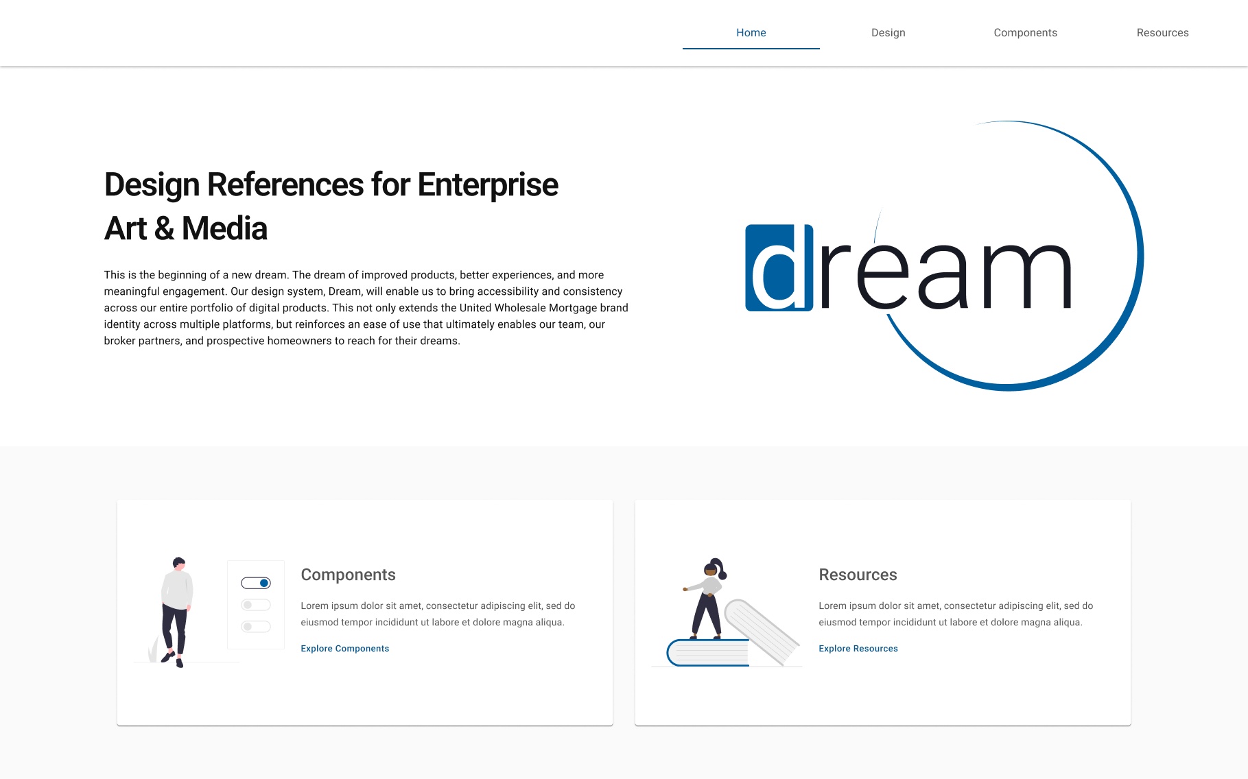
Prototype
A high-fidelity design addressing the friction points surfaced during testing.
Outcome
Some outcomes take time.
At the end of 12 weeks, we presented the design standards website to the entire IT floor at United Wholesale Mortgage. The project was not immediately implemented, but it made the case for why UWM needed a unified design standard.
Two years later, that conviction became the Dream Design System as UWM knows it today. Dream went on to be adopted across 50+ internal projects, ship 60+ components, and become the shared foundation that UWM's entire digital product organization builds on.