Xbox Dashboard Redesign
Solo project, start to finish
- Company
- Personal Project
- Industry
- Gaming
- Timeline
- May 2022 – Sept. 2022
- Duration
- 5 months
TL;DR
- A solo project from start to finish: research, design, iteration, and the final Figma prototype.
- All 20 users I surveyed played 1–2 games a week. The dashboard showed seven, plus ads.
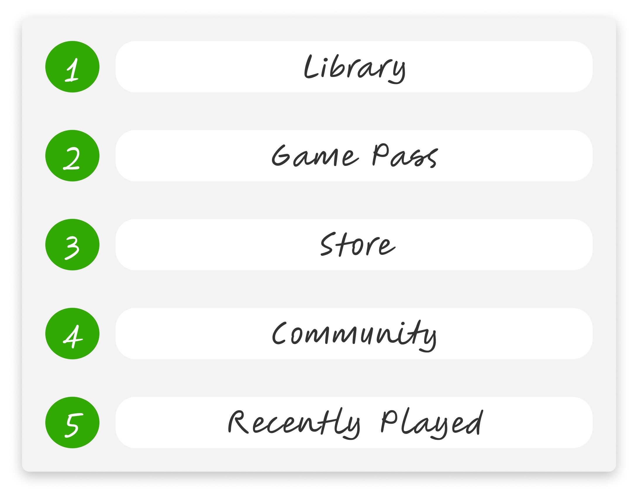
- Card ranking with 10 participants set the navigation hierarchy: Library first, Recently Played last.
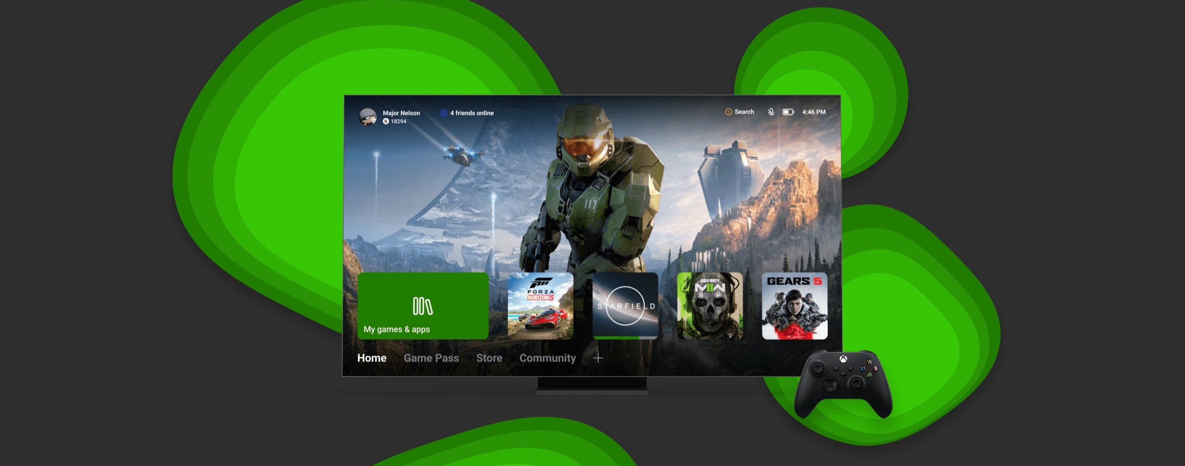
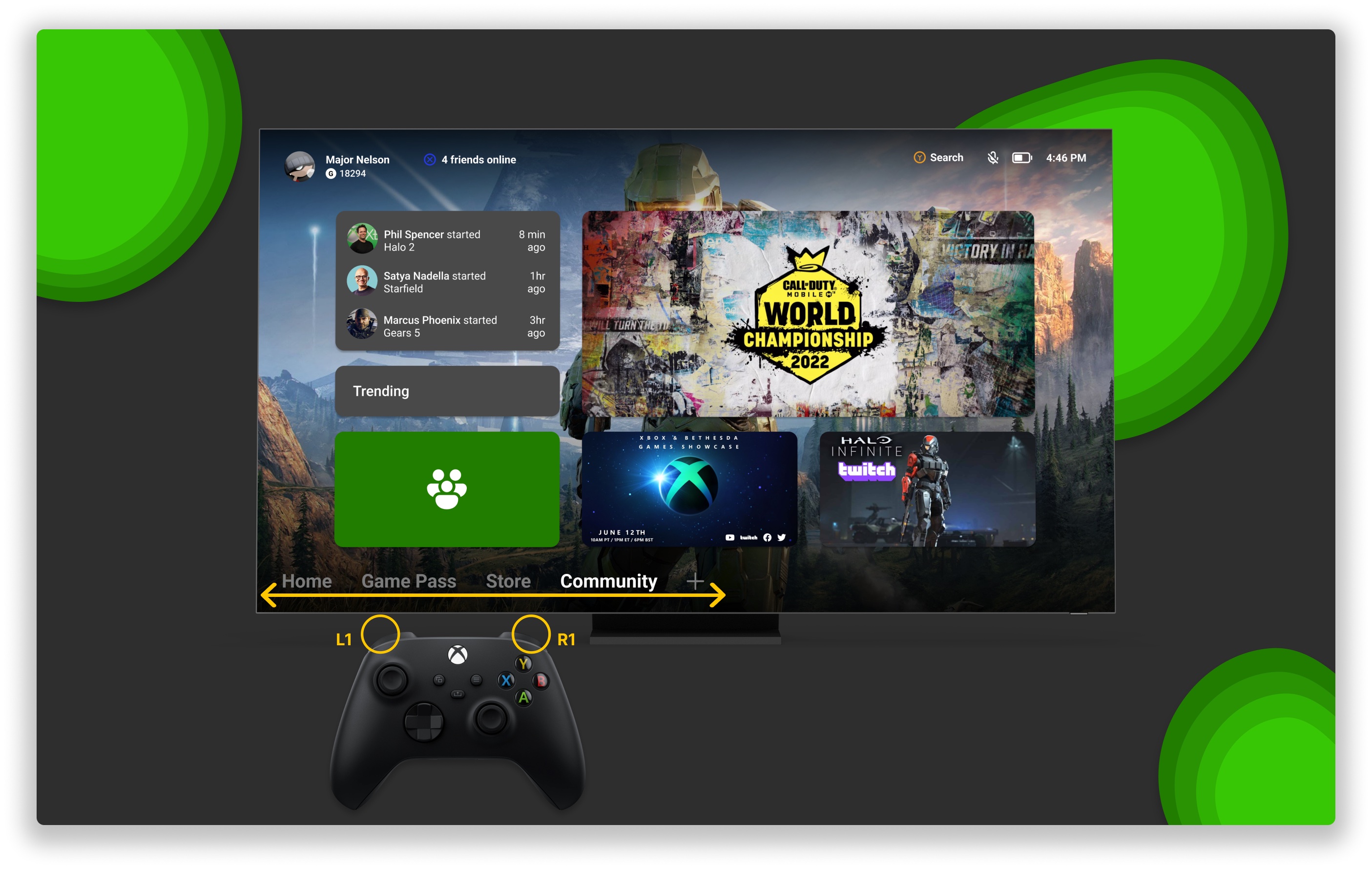
- Redesigned around a horizontal nav mapped to controller bumpers and a decluttered home screen.
- In SUS testing, the redesign scored a 70 against the 2022 dashboard's 62.
- User Research
- Surveys
- Card Ranking
- Wireframing
- Prototyping
- Figma
As a gamer and a designer, I wanted to take on a personal project that sat at the intersection of both. The Xbox dashboard was something I used every day, and something I heard other gamers complain about just as often. The interface was cluttered, navigation was buried, and the background art was barely visible behind a wall of tiles and advertisements.
I set out to redesign it. Working solo, I ran surveys with 20 gamers, conducted card ranking exercises with 10 participants, and used those findings to inform design decisions from sketches through to a final high-fidelity prototype. The goal was simple: make the Xbox dashboard feel like it was built for gamers, not advertisers.
My Role
This was a solo project from start to finish. I owned every phase: research, design, survey distribution, card ranking facilitation, sketching, wireframing, iteration, and high-fidelity prototyping in Figma. The gaming community was my research pool. I brought the questions, they brought the honesty.
Problem
Through a survey of 20 Xbox users, one theme came up repeatedly. The dashboard was overwhelming. Users described the home screen as cluttered, confusing, and full of content they never asked for.
The data backed it up. All 20 respondents said they only play one or two different games per week, yet the recently played list displayed seven. Advertisements lived on the home page. Navigation was buried in the bottom left corner with no clear hierarchy. And the background art, one of the most visually distinctive parts of the Xbox experience, was barely visible behind a wall of tiles.
Xbox users were not confused about what they wanted to do. They were confused by an interface that made it harder than it needed to be.
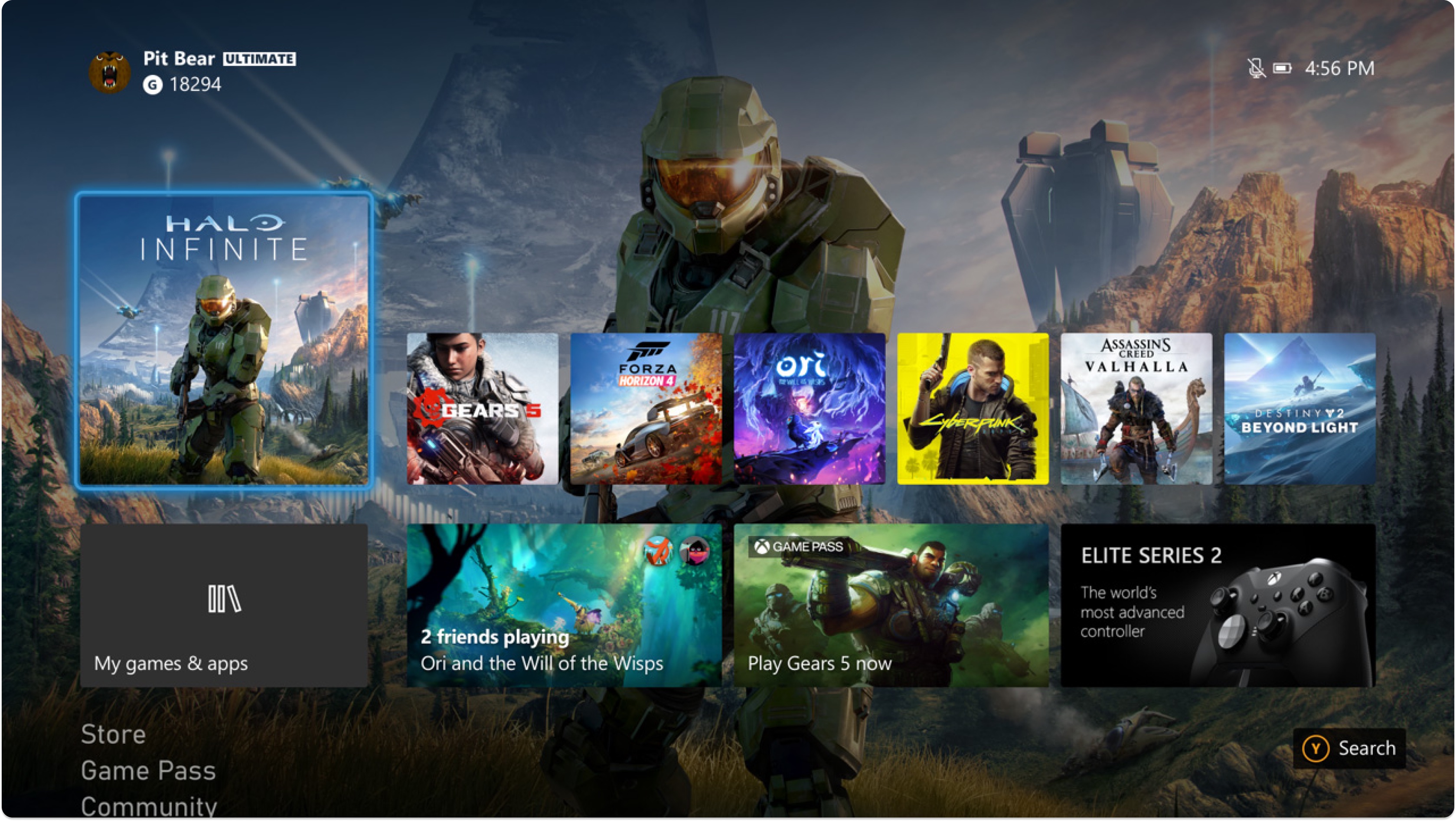
- Background art hidden
- 50%
- Too many choices
- 7 games
“You literally can barely see the wallpaper behind all this junk.”
“The home page has too much going on. There are too many ads displayed.”
“Seems like there are too many boxes, it's confusing.”
Research
Three methods to understand the community. Surfacing the real pain points behind the complaints, then measuring whether the redesign fixed them.
- 01
Survey
A survey of 20 Xbox users was conducted to understand usage patterns and surface frustrations with the current dashboard. Every single respondent said they play only one or two different games per week, yet the dashboard displayed seven in the recently played list. Users also flagged cluttered tiles, too many ads on the home screen, and difficulty finding what they needed quickly.
- 20 Participants
- Usage Patterns
- 02
Card Ranking
10 participants were asked to rank the five main sections of the Xbox interface in order of importance. Library came out on top, followed by Game Pass, Store, Community, and Recently Played. These findings directly informed the navigation hierarchy in the redesign, putting the most important sections front and center.
- 10 Participants
- Information Architecture
- 03
SUS Testing
To validate the redesign, I ran comparative System Usability Scale testing with 12 participants. Each completed the same set of tasks on the 2022 dashboard and on the redesigned prototype, answering the standard 10-item SUS questionnaire immediately after each. The original dashboard scored a 62, below the published industry average of 68. The redesign scored a 70, moving the experience from below average to above it.
- 12 Participants
- System Usability Scale
- Comparative Testing
Solution
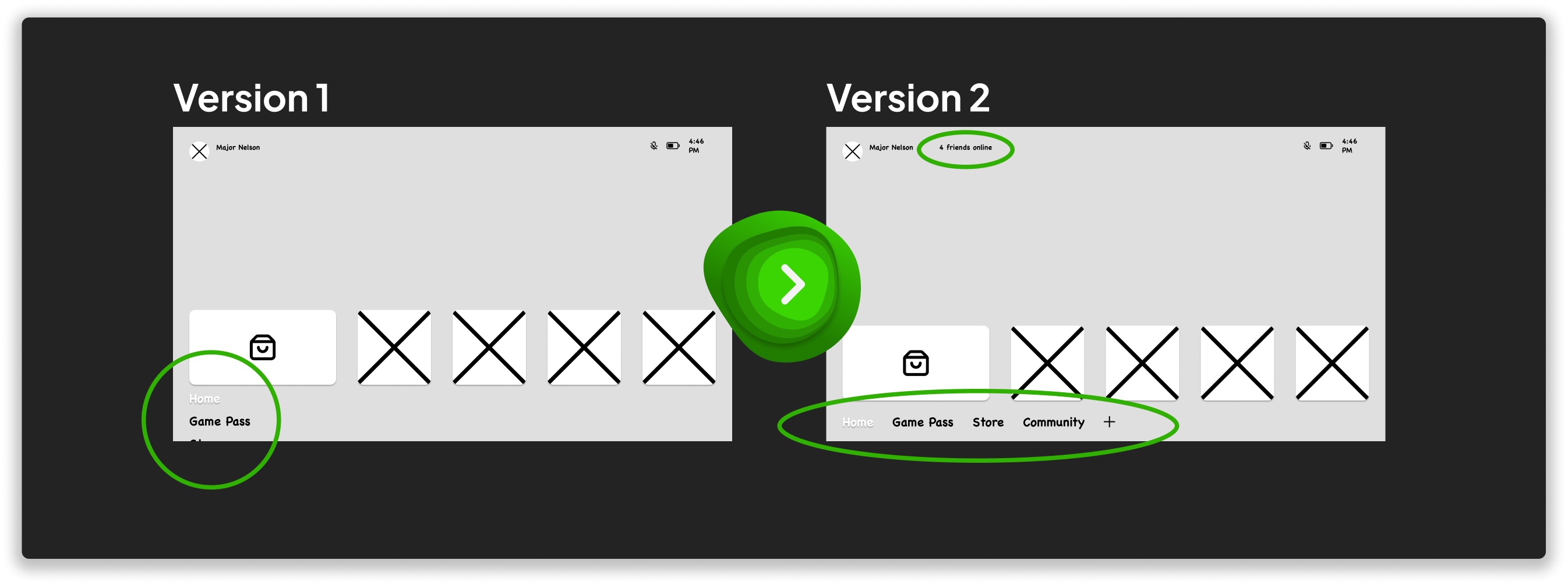
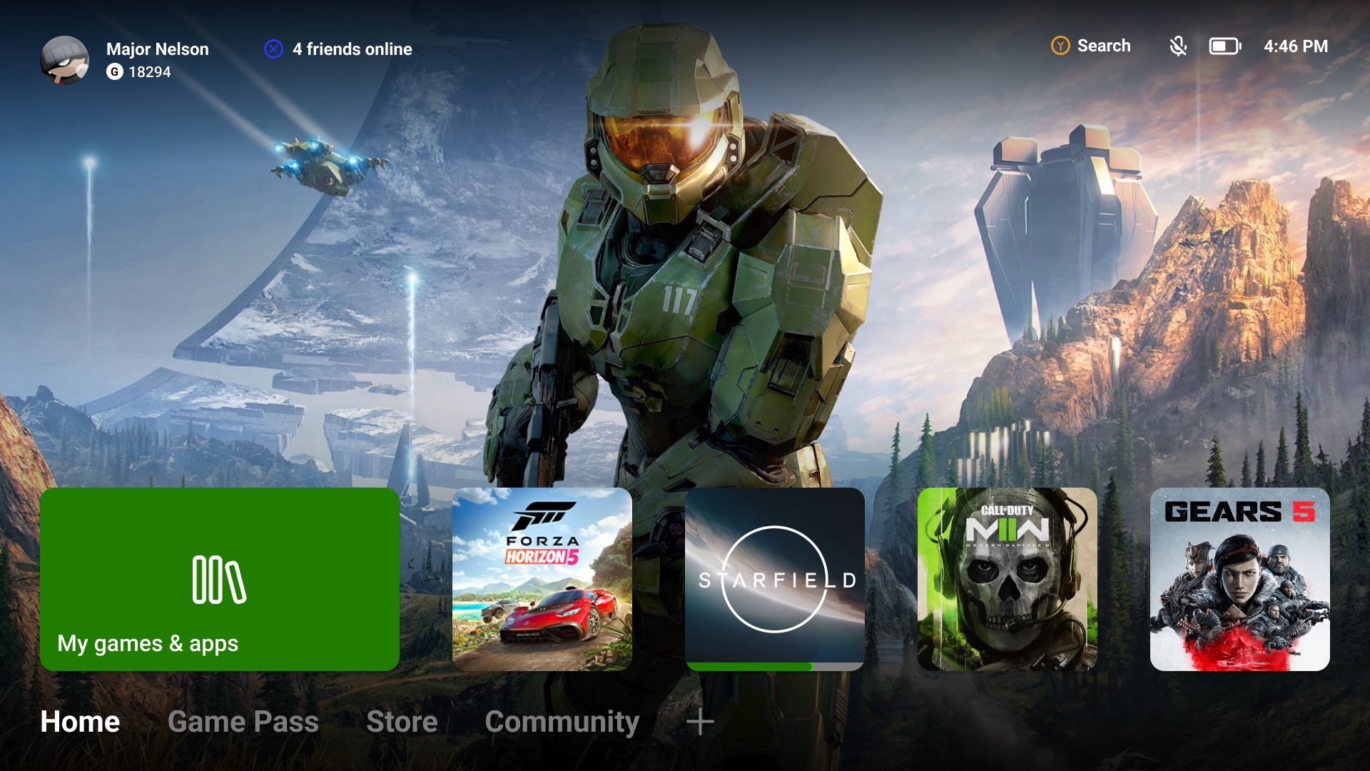
The solution was a redesigned Xbox dashboard that stripped away everything competing for the user's attention. Recently played titles sit front and center, and a horizontal navigation bar replaces the vertical navigation. The horizontal layout maps naturally to the left and right bumpers on an Xbox controller, which players already use to move between tabs. Store promotions and Game Pass content were moved to their own dedicated tabs, giving the home screen a clear, singular purpose.
From sketches to high-fidelity prototype
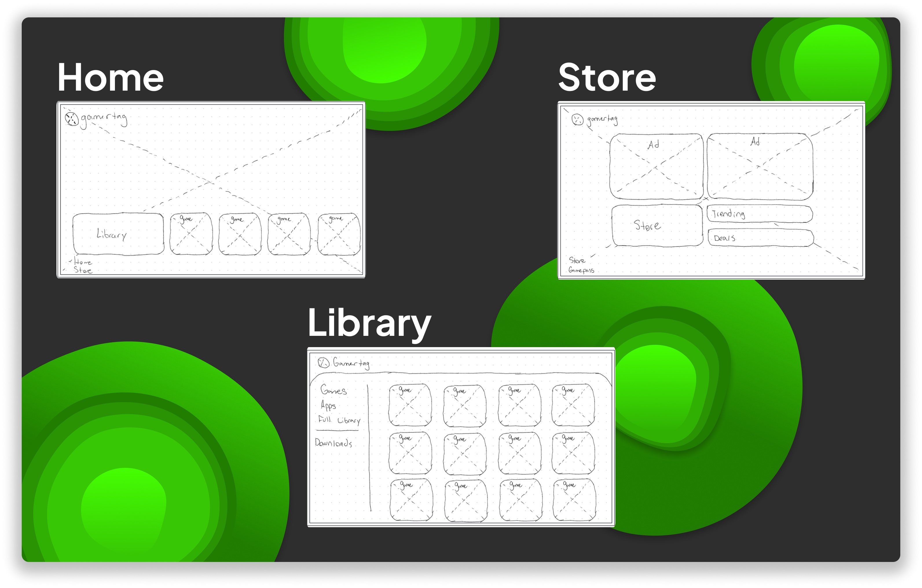
With research findings in hand, the first step was getting ideas on paper. Sketches explored the layout of three key pages: Home, Store, and Library. The goal was to strip the interface back to its core, removing the clutter and rebuilding the hierarchy around what users actually needed.
- 01
Sketches
Layout explorations for Home, Store, and Library, stripping the interface back to its core.
- 02
Wireframes
Structure and hierarchy rebuilt around what users ranked as most important.
- 03
Prototype
A high-fidelity Figma prototype of the decluttered dashboard.
Outcome
This was a personal project, so while it was never implemented, every decision in the redesign was grounded in real user research, and validated by it. In comparative SUS testing, 12 participants completed the same set of tasks on both versions and answered the SUS questionnaire immediately after each. The 2022 dashboard scored a 62, below the published industry average of 68. The redesign scored a 70, taking the experience from below average to above it.
- 2022 dashboard
- 62 SUS Score
- below the industry average of 68
- The redesign
- 70 SUS Score
- above the industry average
Personal project, not affiliated with or implemented by Microsoft.